Goal
Create a second screen called Settings, then add Navigation Link widgets so an operator can move between screens at runtime.
So far our BoilerHouse project has lived on a single screen. Real projects have many: an overview, a page for alarms, a page for settings, and so on. In this chapter we add a second screen, Settings, and give the operator a way to move between the two. We will build on Settings with some controls in a later chapter.
Part 1: Create a new screen
Start a new screen
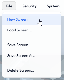
From the File menu choose New Screen.
The canvas resets to the default size and background we set in Project Properties in Chapter 5.
Save first New Screen discards any unsaved changes to the screen you were on. The orange dot we met in Chapter 4 is the reminder to use File > Save Screen before you start.
Name it Settings
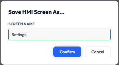
Now choose File > Save Screen As… and name the screen Settings.
Screen names may contain letters, numbers, underscores and hyphens. Anything else, including spaces, is quietly removed from the name.
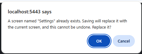
Name already in use? If a screen with that name already exists, Sentinel asks before replacing it. Choose OK to replace the existing screen, or Cancel to go back and pick a different name. If you already have a screen called Settings in your own project, use a different name here, or choose Cancel, so you do not overwrite it.
Part 2: Add a Navigation Link
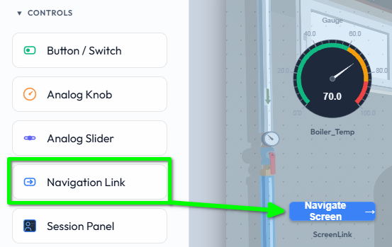
We need a way to get to Settings from our main screen. Open the main screen, then from the Toolbox open the Controls section, choose the Navigation Link and drag it onto the canvas.
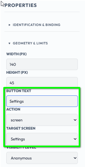
With the link selected, its properties appear in the Properties panel:
Button Text
The label on the link, for example Settings.
Action
What the link does when clicked. For this we use screen.
Target Screen
The screen to go to: choose Settings.
Link Style
Button
A filled button. This is the default look.
Text
A plain text label.
Hotspot
An invisible clickable area. Draw it over an image or symbol to make that part of the screen a link.
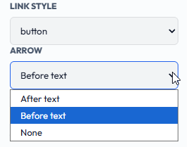
Arrow
After text
A right arrow after the label. This is the default.
Before text
A left arrow before the label.
None
No arrow.
The Arrow setting applies to the Button and Text styles. A Hotspot has no label, so the setting is hidden for it. When you change a link's Action to login, logout or exitKiosk, the arrow turns off by itself, since an arrow suggests going somewhere, and it comes back if you change the Action back to screen. A choice you made deliberately, such as Before text, is never changed.
Always on top A Navigation Link always sits on top of every other widget on the screen. There are no Layer Order controls for it, and it does not need any: wherever you place it, even over an image, a symbol or a Hotspot's target, its click area stays reachable and can never end up hidden underneath something else.
Save the screen Be sure to save the screen now, with File > Save Screen.
Part 3: Link back again
A one-way trip is not much use. We need a counter link on the target screen, and we can take a short cut here: select the link you just made and copy it with Ctrl+C.
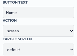
Open your new Settings screen, paste, and set the link's Target Screen to the main screen so the operator can return. In our example the link is labelled Home and points at the default screen. A left arrow suits a link that goes back, so set its Arrow to Before text and it reads ← Home.
Tip For a consistent navigation bar, place the links in the same position on every screen. Once you have built one, copy and paste it between screens rather than building it again.
Part 4: Try it in Run Mode
Navigation Links only act in Run Mode. In Design Mode, clicking a link just selects it so you can edit it.
Switch to Run Mode from the View menu and click the Settings link. The screen changes. Click the link on Settings to come back.
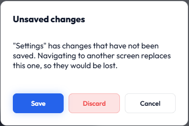
Edits you make in Design Mode stay on the canvas when you switch to Run Mode to try them out, and the orange unsaved dot stays on. Clicking a link loads another screen, which would replace them, so if the screen has unsaved changes Sentinel asks first:
Save
Saves the screen, then goes to the linked screen.
Discard
Throws the changes away and goes on to the linked screen.
Cancel
Stays on this screen, so you can go back to Design Mode and save it yourself.
You will not lose work by accident. A screen that has never been saved has no name to save under, so for that case the prompt has no Save button and suggests File > Save Screen As… first.
Part 5: Other link actions
A Navigation Link does not have to change screen. Its Action can also be:
login
Open the login dialog.
logout
Log out the current session. The canvas keeps running.
exitKiosk
Leave Kiosk Mode.
These are never access-gated, since they are not tied to a target screen. We met login and logout from the Session Panel in Chapter 3.
Part 6: Who sees what
Two settings control who can use a link:
Visibility Level
On the link itself: the minimum role needed to even see it.
Access Level
On the target screen: the minimum role needed to open it. This is the Screen Property from Chapter 6.
A link can be visible to everyone but greyed out for every user below a certain access level, such as Engineer, as in Chapter 6's example. See Chapter 6 for the full walk-through.
Summary
File > New Screen starts a fresh screen from the project defaults; Save Screen As… names it, and asks before replacing a screen that already has that name.
A Navigation Link with Action screen and a Target Screen moves the operator between screens in Run Mode, and always sits on top of other widgets.
Put a link on each screen so the operator can get back, and copy a finished navigation bar between screens.
The Arrow can go after the text, before it, or be left off. Links can also log in, log out or leave Kiosk Mode.
Visibility Level is on the link; Access Level is on the target screen.
In this chapter we created a second screen and linked the two together so an operator can move between them. In the next chapter we will make our screens look like a plant, using the built-in graphic objects: pumps, valves, tanks and pipes that change with the process.